The renovation of the Heller’s building is a significant transformation, with its entire interior redesigned to better serve modern needs for education, study, and communication. While the inside has been completely remodeled, architects have preserved the century-old exterior, honoring its historical significance and influence on the surrounding campus buildings. In fact, the building’s stone facade served as the foundation for my winning concept.
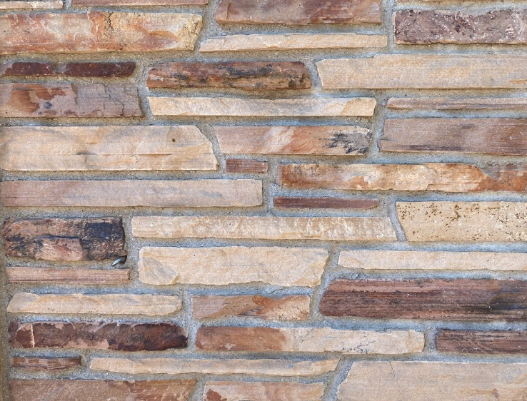
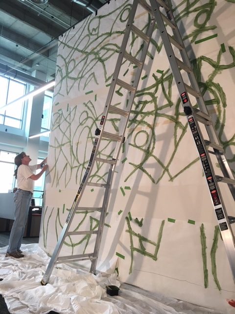
Hellems exterior stonework (gorgeous)
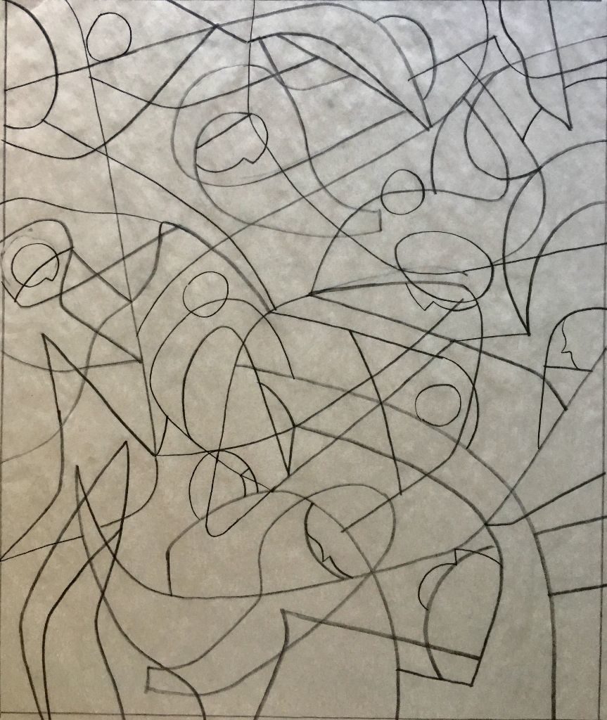
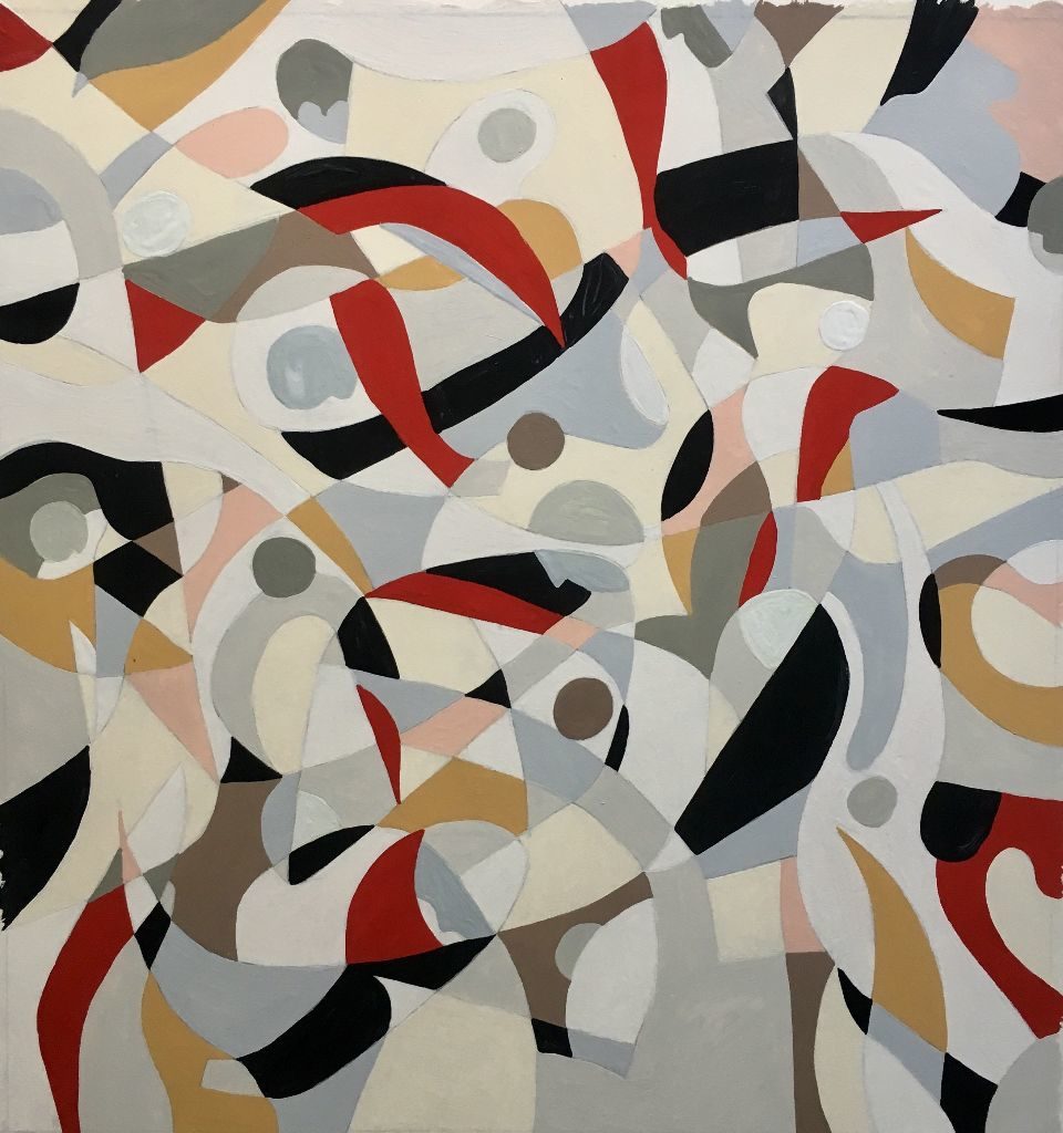
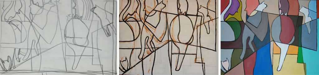
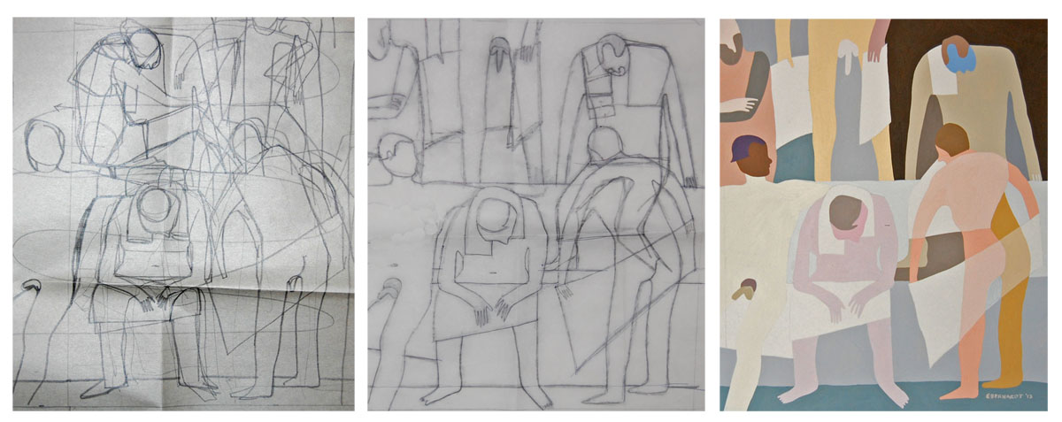
I’ve always been the kind of person who can’t resist picking up an interesting rock. I usually have one in my pocket, and my home is filled with them—lots of them. Naturally, the stonework on the Heller’s building immediately caught my eye, not just for its beautiful composition but for its texture and color. As I developed my proposal, the university provided architectural renderings of the new interior. The renovation wasn’t about structural change but rather about enhancing the experience of those who walk through its doors. As I studied the plans, I realized that, once completed, the building would have no visual representation of the people who inhabit it. My concept was designed to change that.
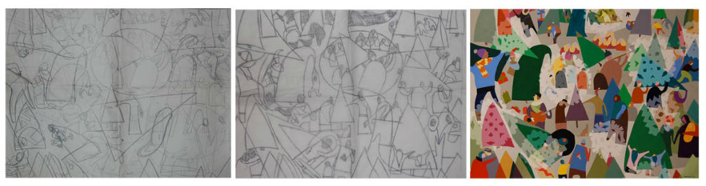
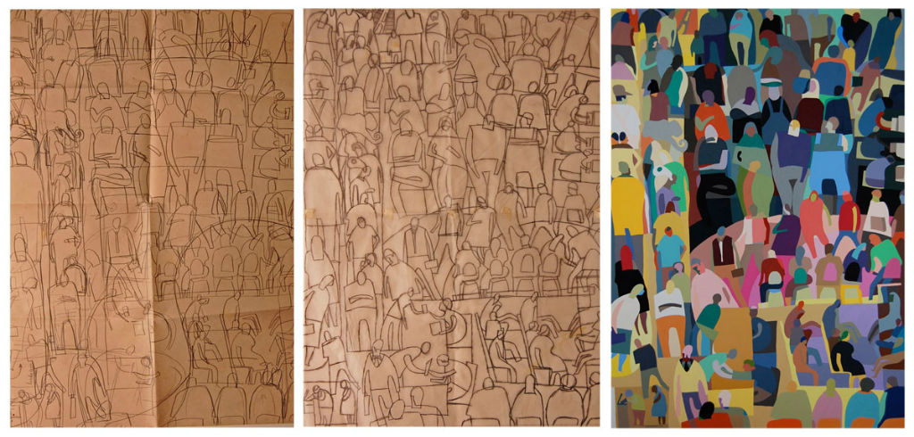
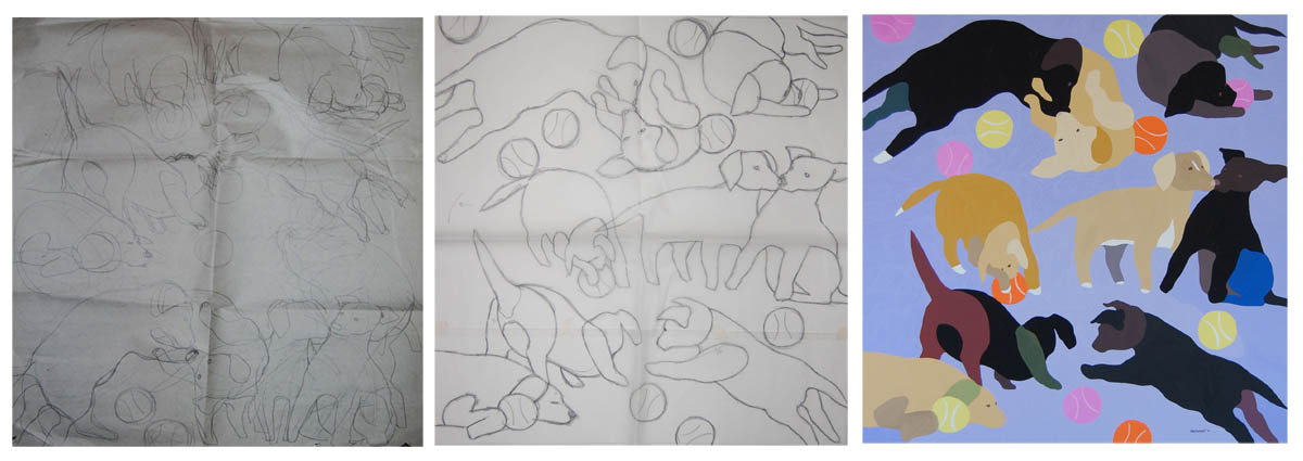
Inspired by the irregular horizontal pattern of the exterior stonework, I proposed creating a gallery of abstract figurative portraits—depicting the very people who bring life to Heller’s building. Students, professors, and administrators who frequent its halls will be the subjects of these paintings, which will line a 20-foot aisle. A large cornerstone painting will serve as a conceptual nod to the language arts majors housed within the building. While each painting will be a distinct portrait—featuring individuals or groups—they will be visually unified through color and pattern, creating a cohesive installation.
During my presentation, I told the committee that I believe public art should belong to the people. My hope is that these paintings will spark curiosity and conversation—students and faculty debating whether a particular portrait is “Sally from Lit 1” or “Professor Smith from French class.” To keep the gallery dynamic, I proposed regularly rotating the paintings, even replacing a certain percentage every few years. I didn’t want the artwork installed in 2025 to still be hanging in the exact same spot in 2125.
The committee clearly embraced my vision, and now I find myself in the midst of creating over 100 paintings for installation before the year’s end. In my next blog post, I’ll share a behind-the-scenes look at my workspace (which required clearing an entire room in my house!) and my process for tackling a project of this scale.
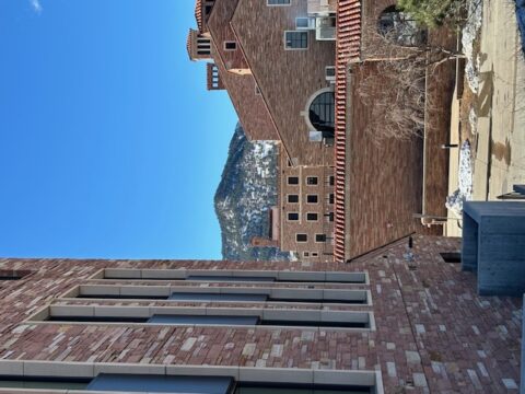
In early 2024, I received exciting news that my work had been selected for consideration in a public art opportunity at the University of Colorado, Boulder. The project was tied to the renovation of the Hellems Arts & Sciences Building, originally constructed in 1921 by architect Charles Z. Klauder in the Tuscan Vernacular style. This was the first building on campus designed in this distinctive style, characterized by the use of native pink sandstone, limestone, black metal accents, and red terra cotta tile roofs. The current renovation aims to reimagine the interior, creating an inclusive and open environment for students that will endure for the next 100 years.
The CU Boulder campus’ distinct architectural style
A portion of the construction budget was allocated for public art, and the university issued a national call for artists to submit their portfolios. From this, a review committee selected about 10 finalists. I was thrilled to learn that I was among them, and I had roughly a month to develop a concept and prepare a presentation.
In February, I flew to Boulder to present my design to the review committee. At the heart of the renovation, this historical building was being transformed to meet the needs of contemporary users, while also considering the next century of student life. The architectural style of the Hellems building has greatly influenced the overall aesthetic of the campus, and I was particularly captivated by the exterior’s stunning stonework. After my presentation, I flew home with no clear sense of how my proposal had been received.
A few weeks later, I was notified that I had been awarded the project, along with my two preferred installation locations: a long aisle on both the second and third floors. The building is slated to reopen in January 2026, with my artwork to be installed by late 2025.
What was my winning concept? I’ll reveal that in my next blog post.
One aspect of self-employment that I particularly enjoy are the unexpected surprises – projects that land on your doorstep and you never saw them coming. Such was the case when I received an email from an old friend with whom I worked about 20 years ago, Matt Rollins.
Matt, Executive Creative Director at Adrenaline Agency, wondered if I might be interested in doing a mural for their new Atlanta office space. Sparks flew from the keyboard as I typed YES and hit reply.
The new space is the vision of Saray Gill, Senior Designer at Adrenaline. She and Matt had a clear idea what they wanted – an abstract piece much like one of my gouache pieces, “Running with the Bulls”. They like the linear movement, the organic forms and similar colors which coincidentally matched the new space design.
I worked through a series of rough doodles the only direction Matt offered ‘it could be a little more abstract’. Music to my ears! We settled on a composition then quick approval on a finished line drawing and we were ready to work onsight.
I partnered with an artist friend, Kathy Duke. I knew that she knew how to hold a brush, and apply color and was confident she could execute in my style. Kathy also had experience with large pieces and offered many time saving suggestions.
Math Sucks
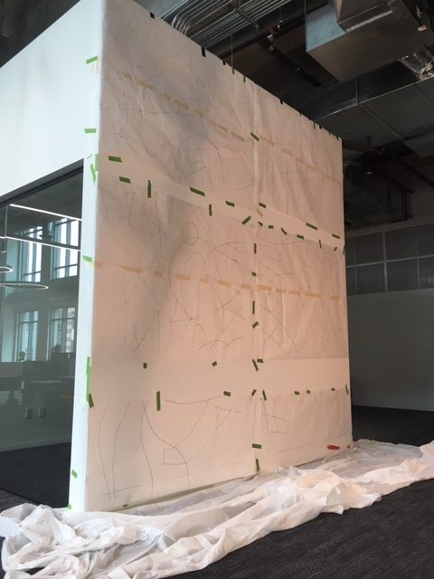
The first task was to enlarge the drawing to full size. Working in Kathy’s basement, we scaled the drawing in photoshop then projected sections onto rolls of butcher paper. Sounds easy enough except we had a glitch. When pricing the mural, the folks from Adrenaline provided specs for the wall 10 feet wide and 12 tall. A few days before Kathy and I started the enlargement, I met Saray at the new space for a quick tour. I wanted to check the wall surface, see the space where we would be working, what access would we have for hauling in and storing our supplies and to double check the wall size. The wall was 13 feet wide and 14 tall. Time to punt.
Back in Kathy’s basement, we had to use math to calculate the percentage of enlargement. It was no longer a clean 1 to 1 ratio and to boot the proportions were now different. We recalculated the percentage increase and kept moving.
Pin Holes
We had nine 3 x 6 ½’ rolls of paper spread across the basement floor. We used ponce wheels to trace the design, the wheel punching tiny holes through the butcher paper. The plan was to assemble the nine sections on the mural wall then use a brush to push watered acrylic paint through the holes as a means to transfer the design to the dry wall. It worked like a charm.
Choosing Colors
I spent two days painting a color guide. The bull painting that Saray and Matt liked is fairly monochromatic but when you look closely its comprised of dozens of similar shades and values. We couldn’t paint the mural like that, we would never finish. I decided to focus on four central colors supported by six highlights. Kathy and I took the finished mock up to Home Depot. They scanned each color section then helped us choose paint chips to match. We bought a gallon for each central color and quarts for the rest.
Day 1
Finally it was time to mural. We loaded Kathy’s truck, filling the back with our ladders and supplies, and headed to Buckhead. The folks at Adrenaline had only moved into the space three days earlier. Their new office is at the Lindburg City Center. The space is stunning, to me like a cathedral. Our mural is located to the right of the entry in one of the two pass thru areas. On the opposite the reception area is a glass conference room with full view of the mural. Most visual elements within the office are black, white with a few red highlights, angular sharp linear design. The mural is the only organic visual in the space. Kathy and I set up our space, taped off the walls and floorboard and transferred the design to the dry wall. We even had time to start painting – salmon pink.
Day 2
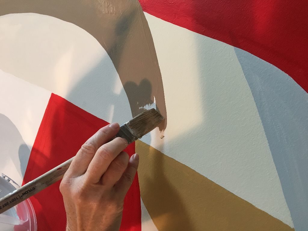
It was a little disorienting to look at my small mock up then find the right spot to paint 17 (and a fraction) times larger on the wall. So we focused on painting the highlight colors to provide anchors or reference points for the larger shapes. We made good progress getting ochre, dark gray, warm gray and cocoa on the wall. Kathy didn’t want to leave for the day until she painted a few red sections. Without any black yet to balance it, the red SCREAMED from the wall.
Day 3
We made such good progress the day before and I got a bit sassy projecting that we might finish on today. I didn’t anticipate that we were both getting physically and mentally tired at this point. While painting, we are so focused on what we are doing, we rarely spoke and when one of us looked at the time 2 or 3 hours had passed, when it seemed like it was less than half that. Moving that 60 lb, 14 foot ladder about 20 times a day was wearing. Our feet hurt from standing on the narrow ladder rungs and our shins were covered with bruises from leaning into the ladder to reach the mural. We cracked open two of the gallon size colors and were at the point where color blocks were touching. At this point painting slowed significantly. Now we weren’t just painting disparate individual color shapes but we also had to be cognizant of intersection points and over arching linear flows, grander shapes moving across the entire face of the mural. While painting one color, we had to be careful that the arches and angles matched the surrounding colors. So trips up and down the ladder doubled because it wasn’t always clear up close whether the angles were correct.
Day 4
We were both really tired but hopeful we might finish today. Kathy focused on last highlight colors, the bold red and black. Both required two coats which slowed us. I worked on the principle colors of which there were many more and larger shapes. We worked hard all day, neither of us willing to confess we weren’t going to finish. I broke the ice just before 6, ‘Kathy…’ was all I got out when I heard a quiet ‘I know’. This day reminded me of the last time I moved. I looked around my apartment and thinking I didn’t have that much stuff and it shouldn’t take long to pack it up. Then I started opening drawers and cupboards and it took twice the time I thought. It’s the stuff you don’t see or realize until its in your face that always slows you down. As the mural neared completion, we had to work slower and slower to maintain the overall design integrity. I never anticipated this because it isn’t what I experience painting smaller gouache pieces or with working with and guiding someone else to align with your vision. Today we broke out the micro brushes to paint the very small, tight intersection points between multiple colors.
Day 5
We wore humility to work this day worried that we might not yet finish. We got an earlier start, only took one very short break and managed to finish just before 6 pm. Excited to be finished but equally sad that we were finished. We had a great time working on the mural and in such a beautiful space. The folks at Adrenaline were wonderful hosts, encouraging us as we worked, asking questions about the piece, taking photos.
Someone asked me what the mural was about. They wanted to understand it to explain to clients who would inevitably ask. I don’t like to offer interpretations of my work. A piece means something to me but I prefer that onlookers decide for themselves. So I replied that an abstract piece offers a great opportunity for explanation. If you look at a Rembrandt you might say, it’s a painting of a woman or a plate of oranges. When you look an abstract you simply drop all nouns and describe it using verbs and adjectives. Its about collaboration and teamwork and the creative process and being bold and confident. My response seemed to please him.
I have wanted to paint something big for years and am grateful to Matt and Saray for the chance to create this mural. Kathy was the best partner to work with offering advice that saved us hours and willing. The mural was one of the most physically and mentally draining pieces I’ve created, I wasn’t expecting. I can’t wait to do another large mural.
Adrenaline Agency
The finished designOur 1/17th scale color guideThe design is placed and taped to the wall. I hand drew the sections we missedWe used green paint to transfer the design to the wallA steady hand is a mustThe finished mural
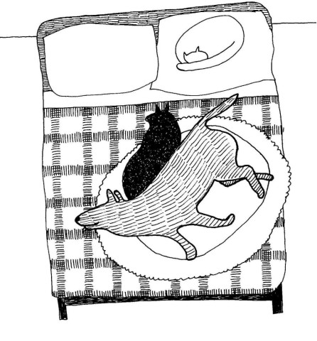
Lucky has lived at Aunt Mel’s farm for many years. When she leaves to run errands, Lucky stays behind and guards the farm, ok, he guards the bed.
Whenever Aunt Mel puts on her shoes, Lucky runs to the bed and lays down. He knows his duty is to secure the home and he chooses to do so from the comfort of a bed and cushy pillows and warm blankets. Usually one or two of the cats join him. They are his leutenants. So as Aunt Mel leaves the house, she peers into the bedroom and everyone is at their post. Lucky wags his tail. Confident in his abilities to take care of things, Aunt Mel leaves, softly closing the front door behind her.
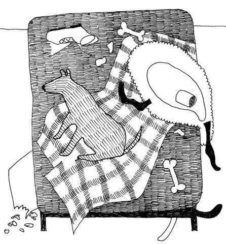
But recently, Lucky has asserted a bit of a passive aggresive streak. As soon as the front door latch clicks closed, he tears up the blankets on the bed, tosses the pillows to the floor, brings his bones, stinking socks from the laundry, muddy barn boots and places them on the bed. Exhausted from all this work, he takes a short nap, then wakes to re-arrange his display followed by another nap. This pattern repeats until Aunt Mel returns to find Lucky proudly sitting in the middle of the bed, happy for her return, tail wagging amidst the mess.