Scroll to the end for progress pics
One aspect of self-employment that I particularly enjoy are the unexpected surprises – projects that land on your doorstep and you never saw them coming. Such was the case when I received an email from an old friend with whom I worked about 20 years ago, Matt Rollins.
Matt, Executive Creative Director at Adrenaline Agency, wondered if I might be interested in doing a mural for their new Atlanta office space. Sparks flew from the keyboard as I typed YES and hit reply.
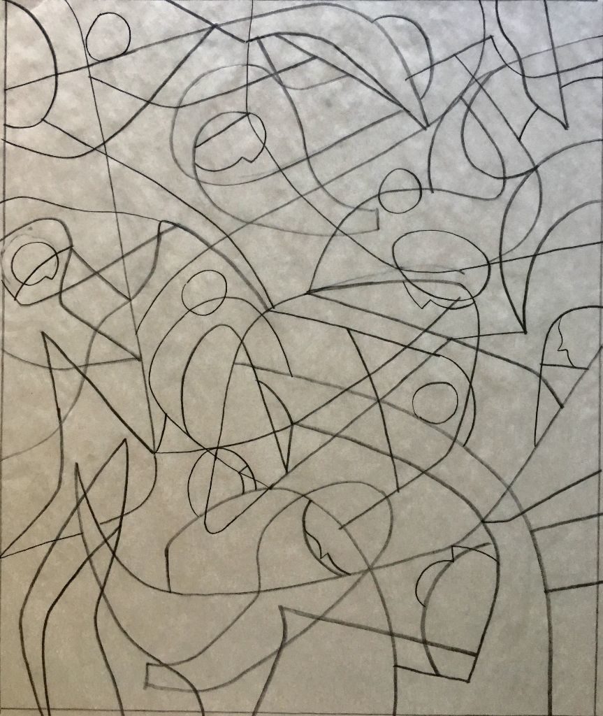
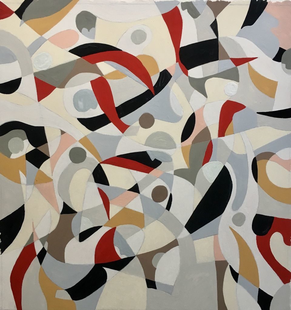
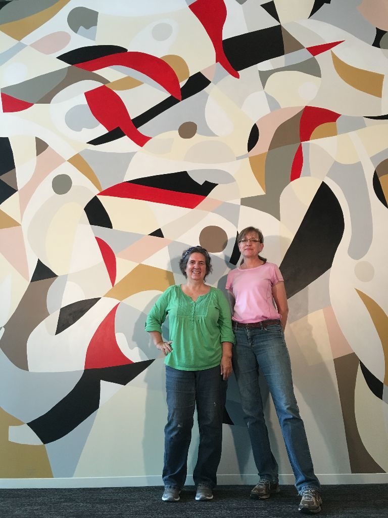
The new space is the vision of Saray Gill, Senior Designer at Adrenaline. She and Matt had a clear idea what they wanted – an abstract piece much like one of my gouache pieces, “Running with the Bulls”. They like the linear movement, the organic forms and similar colors which coincidentally matched the new space design.
I worked through a series of rough doodles the only direction Matt offered ‘it could be a little more abstract’. Music to my ears! We settled on a composition then quick approval on a finished line drawing and we were ready to work onsight.
I partnered with an artist friend, Kathy Duke. I knew that she knew how to hold a brush, and apply color and was confident she could execute in my style. Kathy also had experience with large pieces and offered many time saving suggestions.
Math Sucks
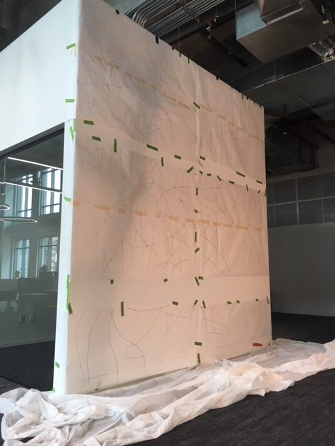
The first task was to enlarge the drawing to full size. Working in Kathy’s basement, we scaled the drawing in photoshop then projected sections onto rolls of butcher paper. Sounds easy enough except we had a glitch. When pricing the mural, the folks from Adrenaline provided specs for the wall 10 feet wide and 12 tall. A few days before Kathy and I started the enlargement, I met Saray at the new space for a quick tour. I wanted to check the wall surface, see the space where we would be working, what access would we have for hauling in and storing our supplies and to double check the wall size. The wall was 13 feet wide and 14 tall. Time to punt.
Back in Kathy’s basement, we had to use math to calculate the percentage of enlargement. It was no longer a clean 1 to 1 ratio and to boot the proportions were now different. We recalculated the percentage increase and kept moving.
Pin Holes
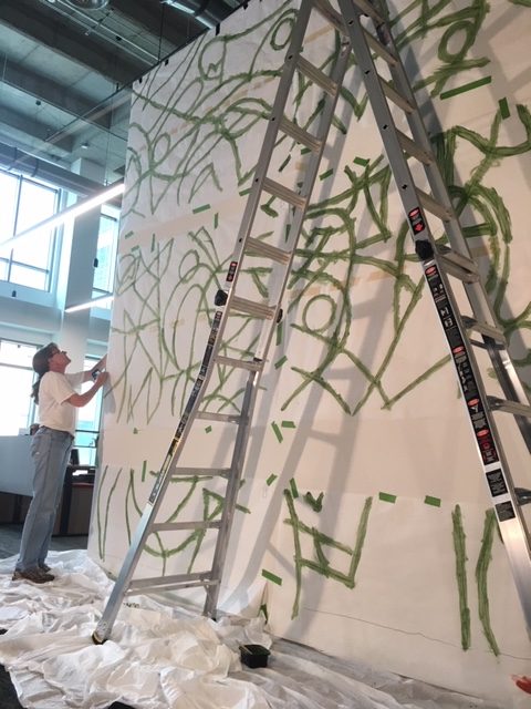
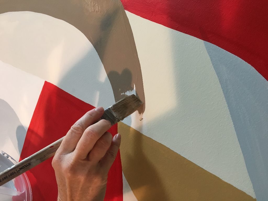
We had nine 3 x 6 ½’ rolls of paper spread across the basement floor. We used ponce wheels to trace the design, the wheel punching tiny holes through the butcher paper. The plan was to assemble the nine sections on the mural wall then use a brush to push watered acrylic paint through the holes as a means to transfer the design to the dry wall. It worked like a charm.
Choosing Colors
I spent two days painting a color guide. The bull painting that Saray and Matt liked is fairly monochromatic but when you look closely its comprised of dozens of similar shades and values. We couldn’t paint the mural like that, we would never finish. I decided to focus on four central colors supported by six highlights. Kathy and I took the finished mock up to Home Depot. They scanned each color section then helped us choose paint chips to match. We bought a gallon for each central color and quarts for the rest.
Day 1
Finally it was time to mural. We loaded Kathy’s truck, filling the back with our ladders and supplies, and headed to Buckhead. The folks at Adrenaline had only moved into the space three days earlier. Their new office is at the Lindburg City Center. The space is stunning, to me like a cathedral. Our mural is located to the right of the entry in one of the two pass thru areas. On the opposite the reception area is a glass conference room with full view of the mural. Most visual elements within the office are black, white with a few red highlights, angular sharp linear design. The mural is the only organic visual in the space. Kathy and I set up our space, taped off the walls and floorboard and transferred the design to the dry wall. We even had time to start painting – salmon pink.
Day 2
It was a little disorienting to look at my small mock up then find the right spot to paint 17 (and a fraction) times larger on the wall. So we focused on painting the highlight colors to provide anchors or reference points for the larger shapes. We made good progress getting ochre, dark gray, warm gray and cocoa on the wall. Kathy didn’t want to leave for the day until she painted a few red sections. Without any black yet to balance it, the red SCREAMED from the wall.
Day 3
We made such good progress the day before and I got a bit sassy projecting that we might finish on today. I didn’t anticipate that we were both getting physically and mentally tired at this point. While painting, we are so focused on what we are doing, we rarely spoke and when one of us looked at the time 2 or 3 hours had passed, when it seemed like it was less than half that. Moving that 60 lb, 14 foot ladder about 20 times a day was wearing. Our feet hurt from standing on the narrow ladder rungs and our shins were covered with bruises from leaning into the ladder to reach the mural. We cracked open two of the gallon size colors and were at the point where color blocks were touching. At this point painting slowed significantly. Now we weren’t just painting disparate individual color shapes but we also had to be cognizant of intersection points and over arching linear flows, grander shapes moving across the entire face of the mural. While painting one color, we had to be careful that the arches and angles matched the surrounding colors. So trips up and down the ladder doubled because it wasn’t always clear up close whether the angles were correct.
Day 4
We were both really tired but hopeful we might finish today. Kathy focused on last highlight colors, the bold red and black. Both required two coats which slowed us. I worked on the principle colors of which there were many more and larger shapes. We worked hard all day, neither of us willing to confess we weren’t going to finish. I broke the ice just before 6, ‘Kathy…’ was all I got out when I heard a quiet ‘I know’. This day reminded me of the last time I moved. I looked around my apartment and thinking I didn’t have that much stuff and it shouldn’t take long to pack it up. Then I started opening drawers and cupboards and it took twice the time I thought. It’s the stuff you don’t see or realize until its in your face that always slows you down. As the mural neared completion, we had to work slower and slower to maintain the overall design integrity. I never anticipated this because it isn’t what I experience painting smaller gouache pieces or with working with and guiding someone else to align with your vision. Today we broke out the micro brushes to paint the very small, tight intersection points between multiple colors.
Day 5
We wore humility to work this day worried that we might not yet finish. We got an earlier start, only took one very short break and managed to finish just before 6 pm. Excited to be finished but equally sad that we were finished. We had a great time working on the mural and in such a beautiful space. The folks at Adrenaline were wonderful hosts, encouraging us as we worked, asking questions about the piece, taking photos.
Someone asked me what the mural was about. They wanted to understand it to explain to clients who would inevitably ask. I don’t like to offer interpretations of my work. A piece means something to me but I prefer that onlookers decide for themselves. So I replied that an abstract piece offers a great opportunity for explanation. If you look at a Rembrandt you might say, it’s a painting of a woman or a plate of oranges. When you look an abstract you simply drop all nouns and describe it using verbs and adjectives. Its about collaboration and teamwork and the creative process and being bold and confident. My response seemed to please him.
I have wanted to paint something big for years and am grateful to Matt and Saray for the chance to create this mural. Kathy was the best partner to work with offering advice that saved us hours and willing. The mural was one of the most physically and mentally draining pieces I’ve created, I wasn’t expecting. I can’t wait to do another large mural.
 Adrenaline Agency